Datscope
Using UI principles to design, create and explain new platforms for complex products.
Industry: Data Management
Category: B2B2B
Year: 2023
Overview
This client creates bespoke systems for their customers, allowing them to use the software to manage the admin side of construction and building site coordination. It is a fairly complex, complicated structure with multiple parts and solutions. My task was to focus on specific areas of the cloud-based software, improving the experience for users, aligning the UI with the brand more and solving pain points that internal and external users had reported.
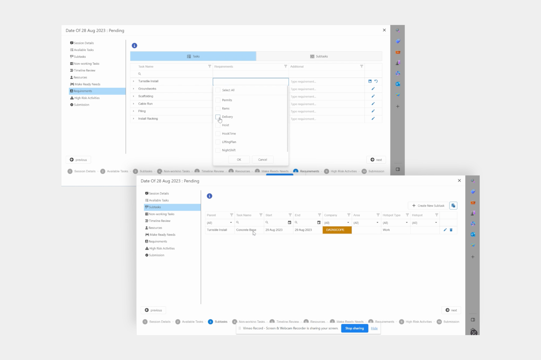
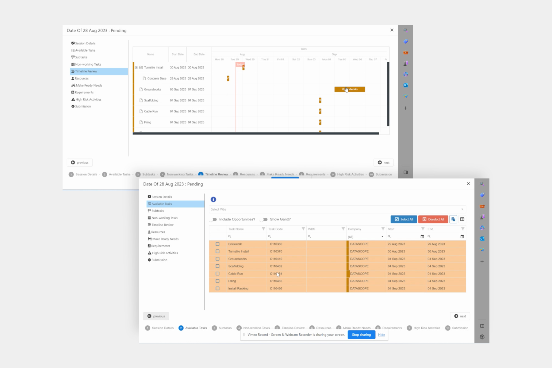
Below are examples of the old system design and interface.
Simple changes led to an improvement in the way users completed tasks.
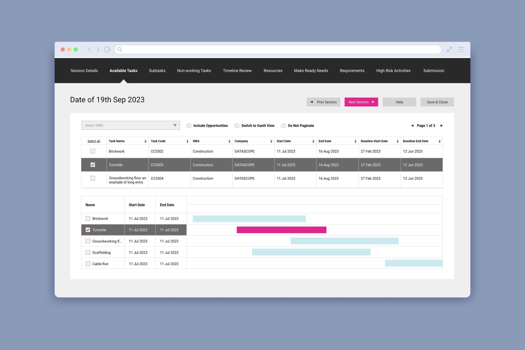
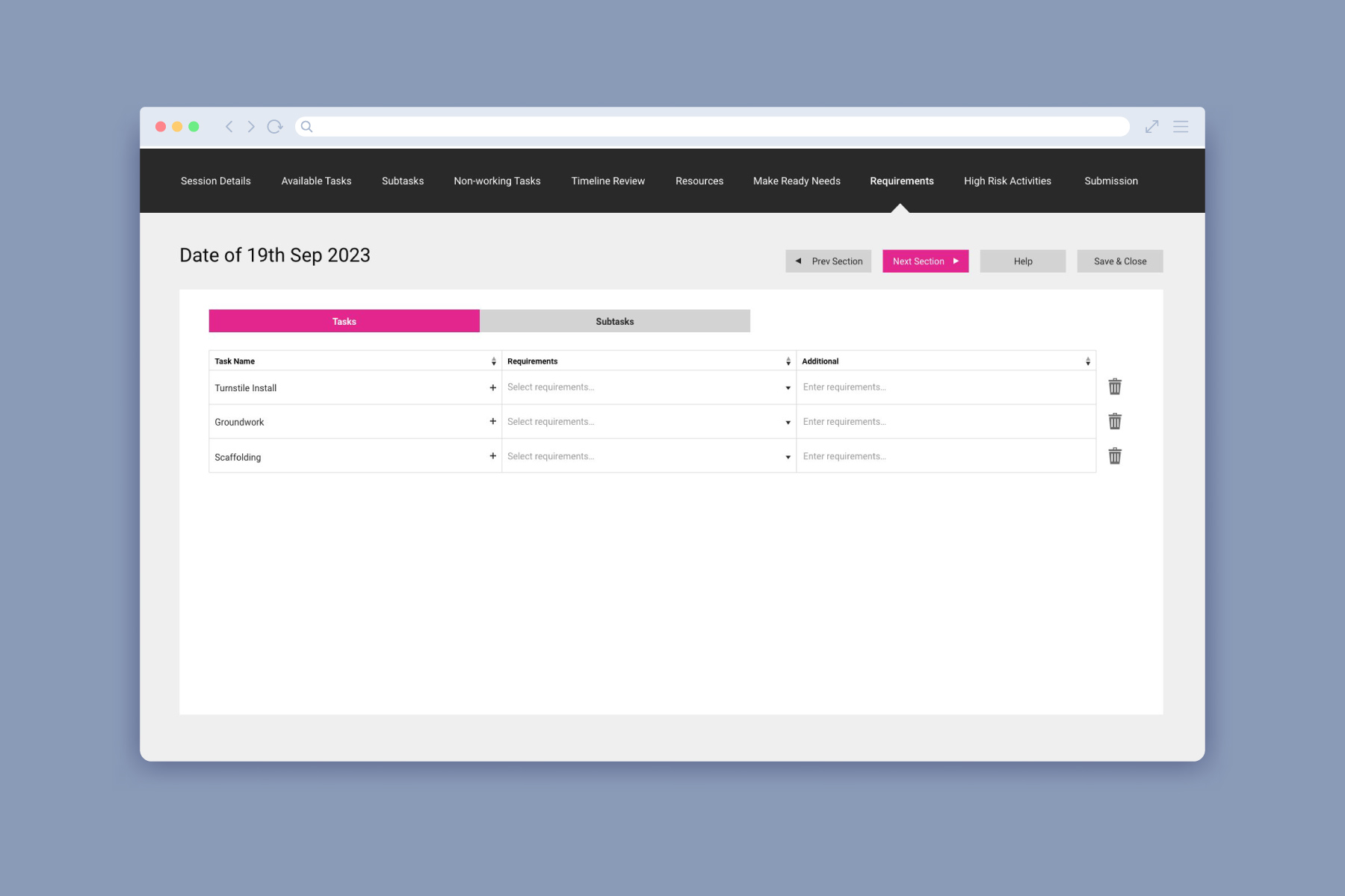
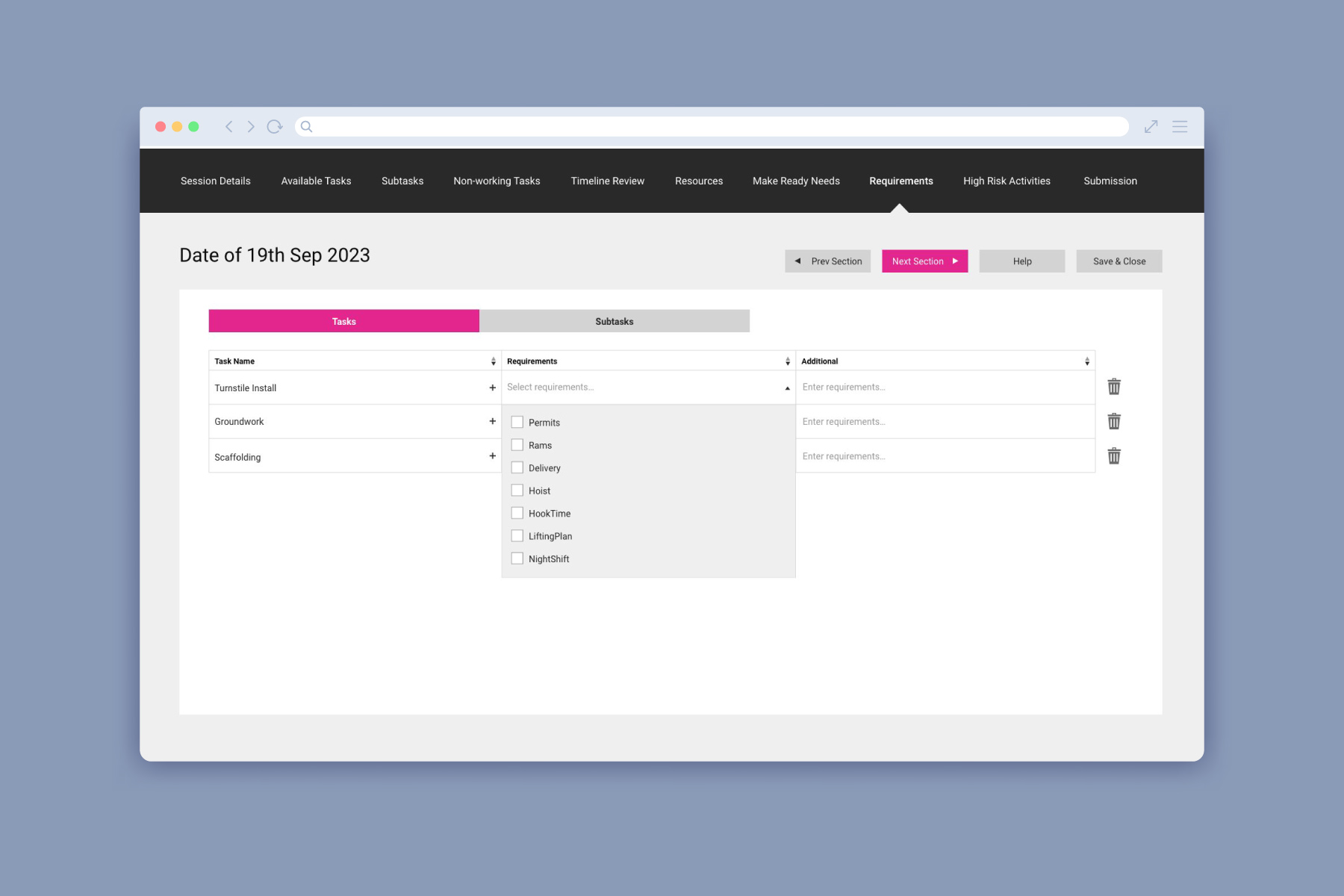
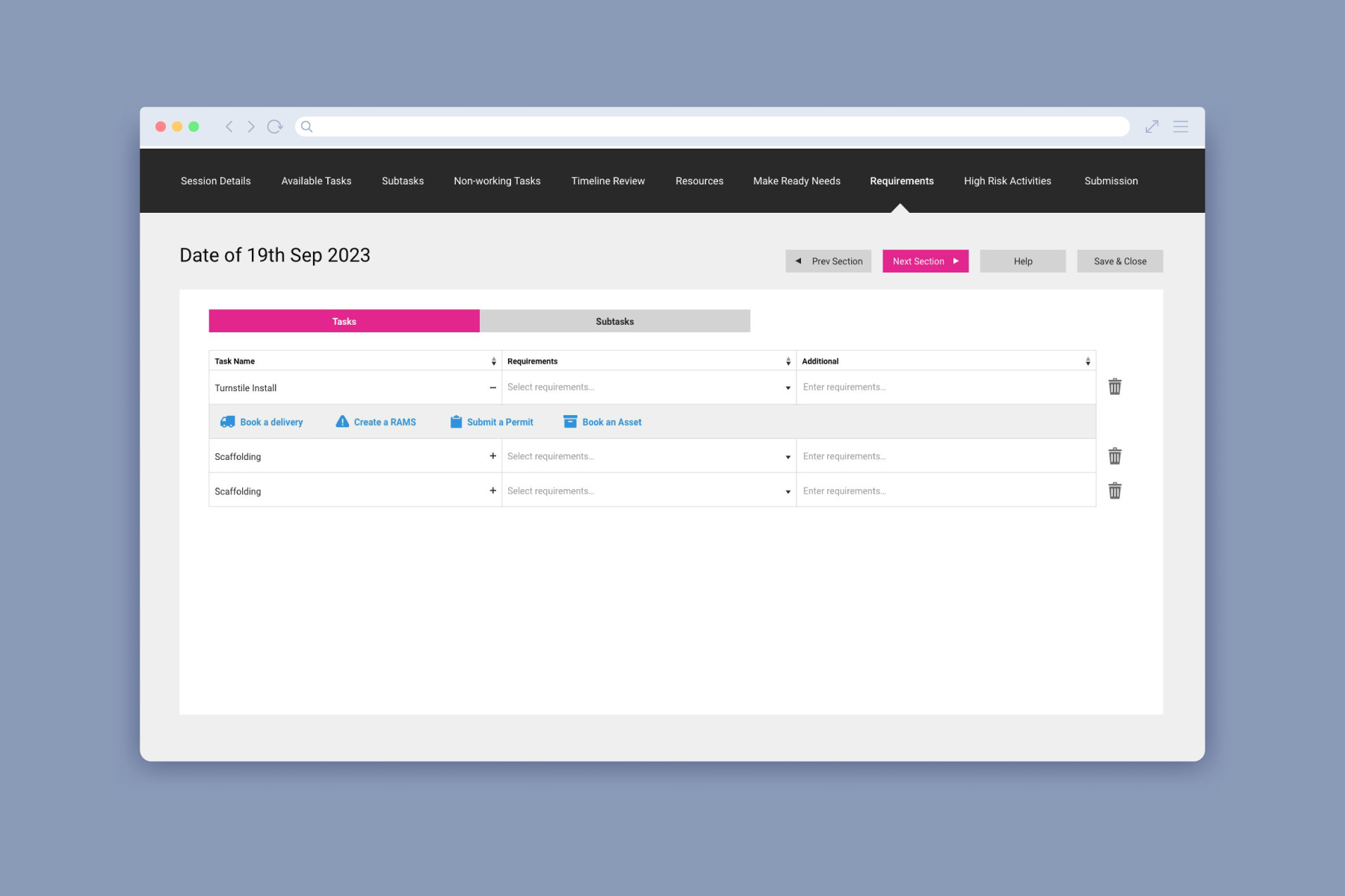
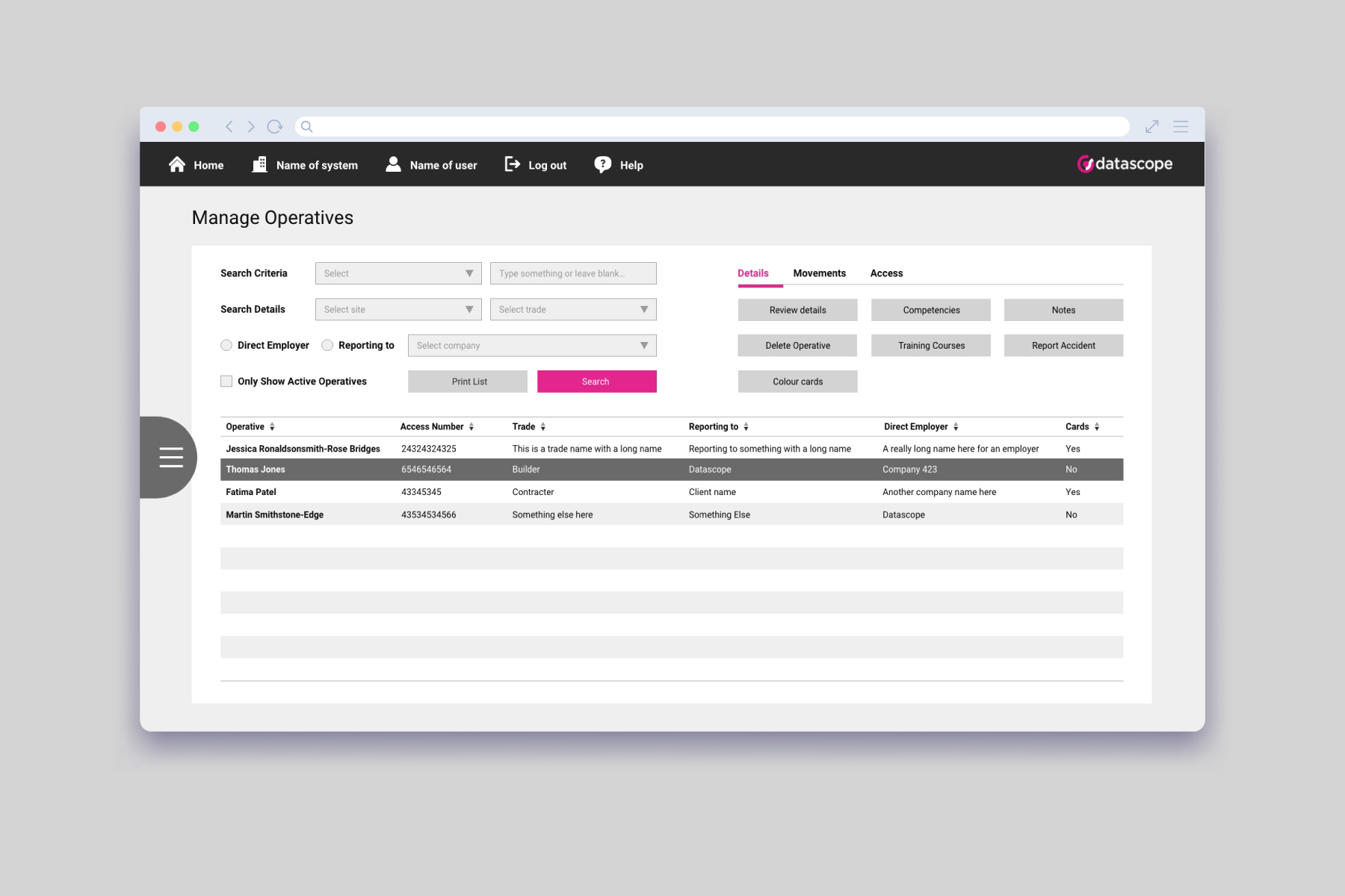
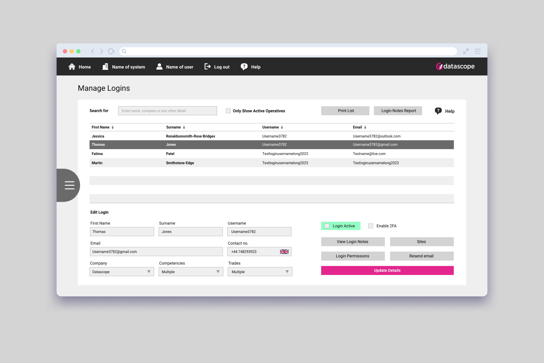
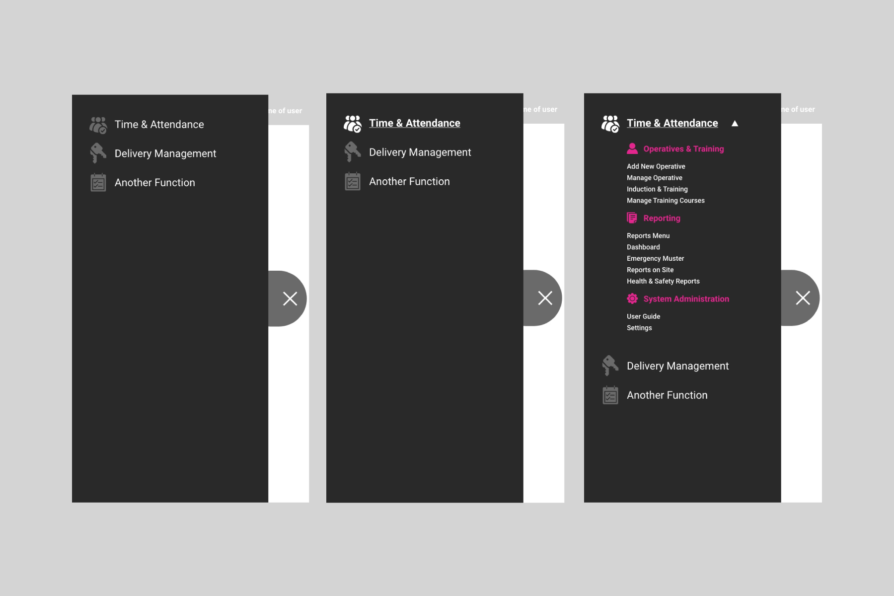
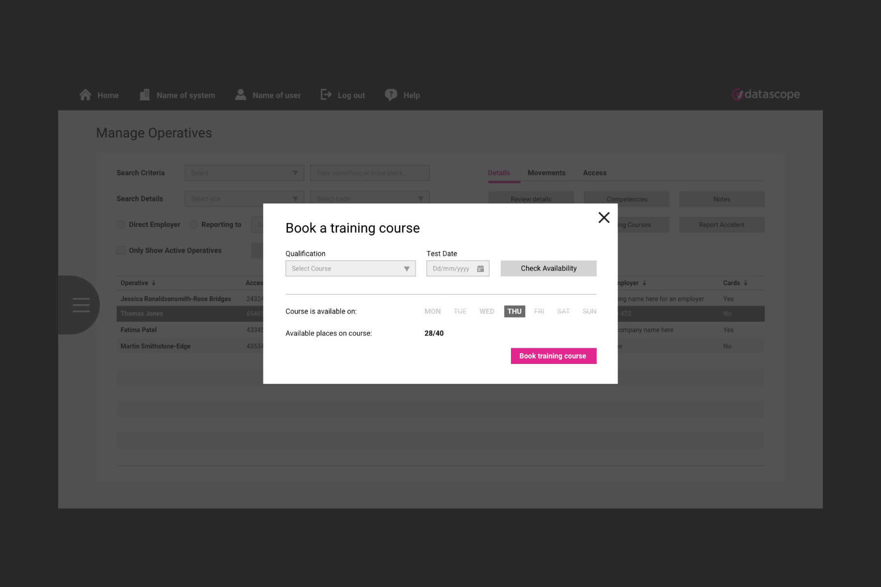
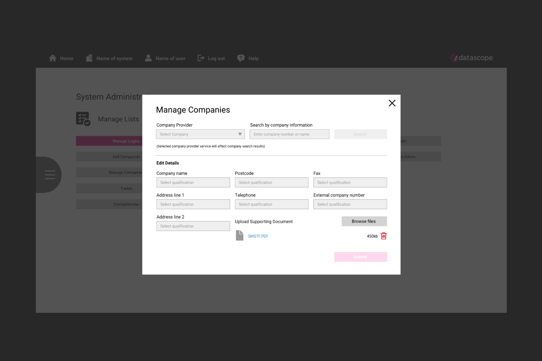
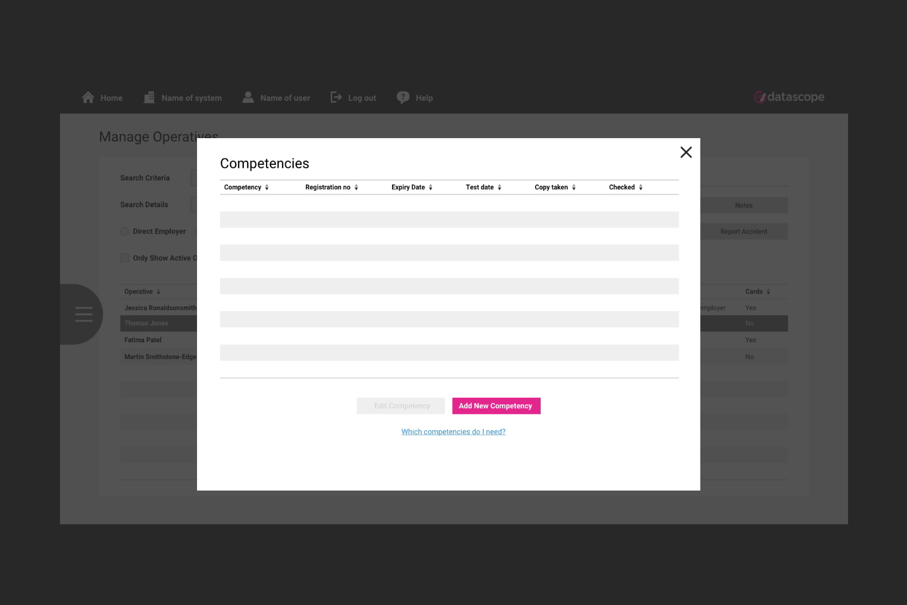
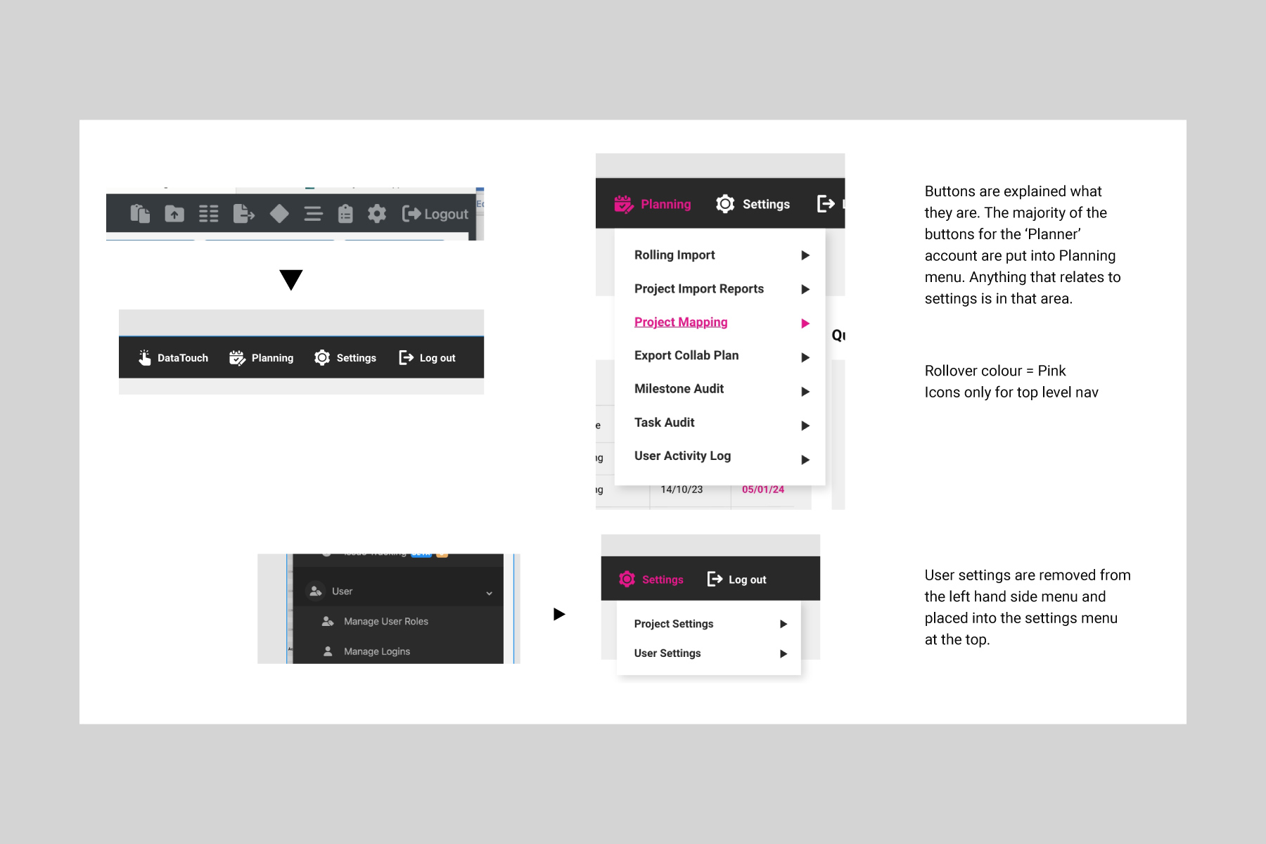
This system below was stage 1 of the development across the various platforms. Key actions and functions had been pulled out in the brand colour to draw attention, the navigation was redesigned alongside various other visual improvements.
These systems were essentially massive forms, and such needed appropriate formatting to equally space the content, with the overall aim being to make everything seem less overwhelming.
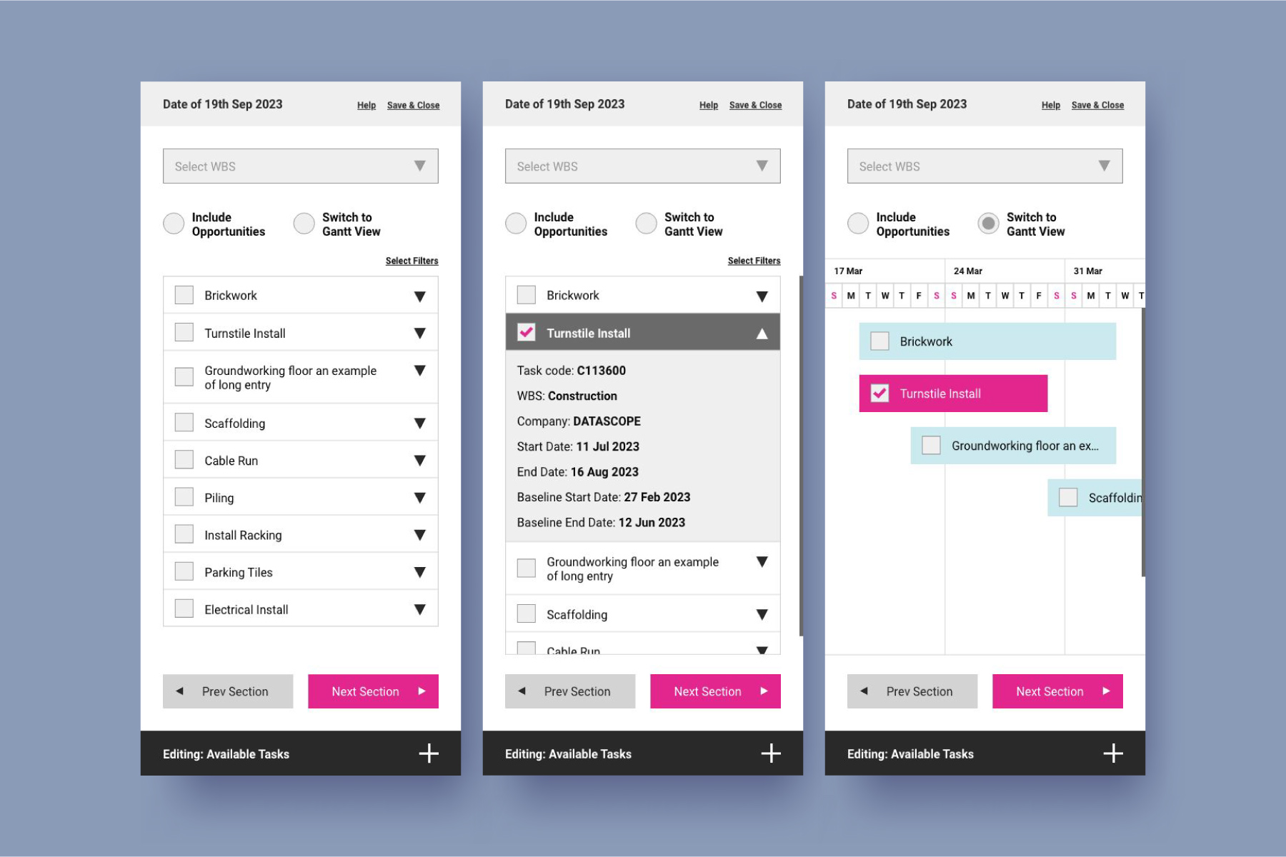
Some areas of the platform had complex charts to fit into an optimal mobile device format.
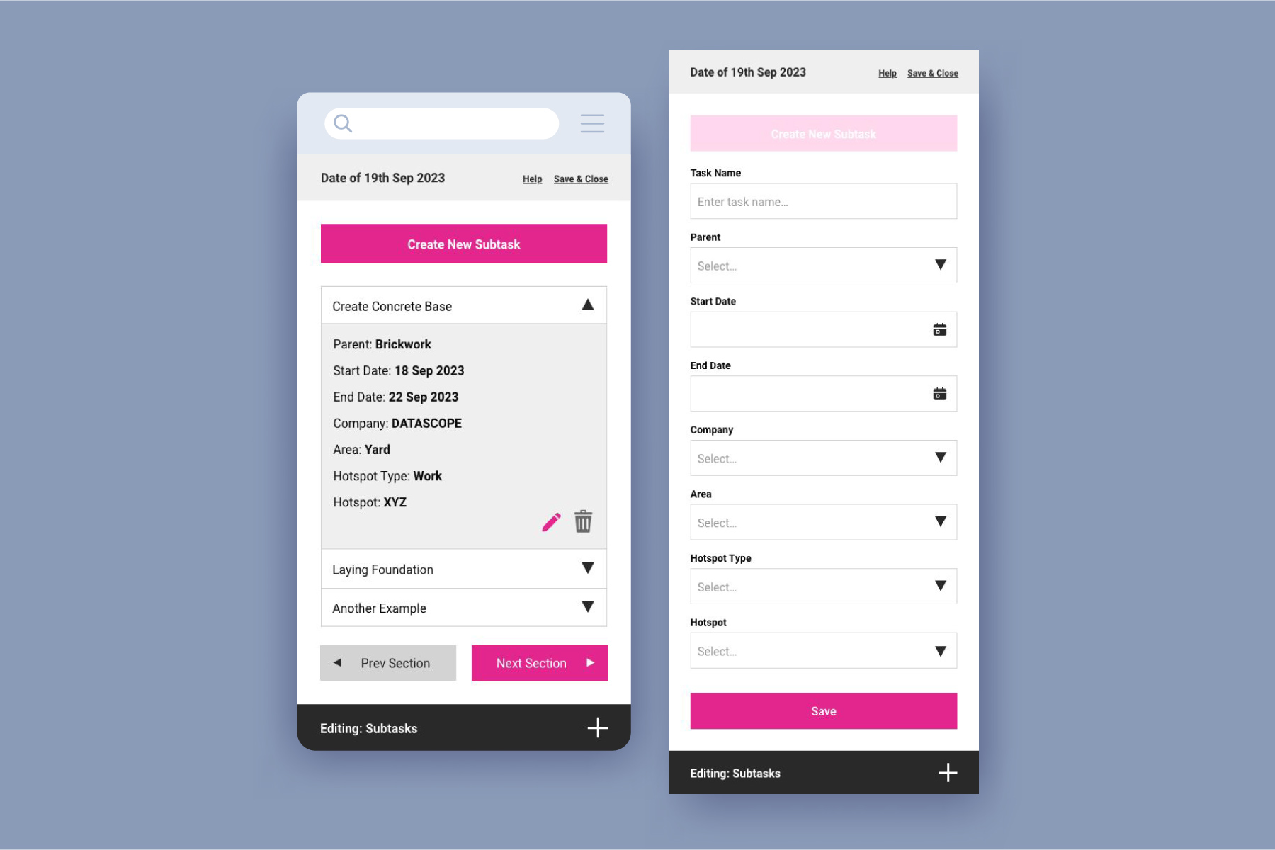
The designs seen below are for another part of the system that was built in a slightly unusual way, hence the need to align everything back together. The aim here was to ensure the design of the previous stage assets was kept consistent for this work, despite the user journey being completed differently.
This part of the system also had to cater for mobile users, which added an extra layer of consideration and additional thought.
