Datscope
Brand design and UI design that appeals to a specific audience in a typically unfussy industry.
Industry: Data Management
Category: B2B2B
Year: 2023
Overview
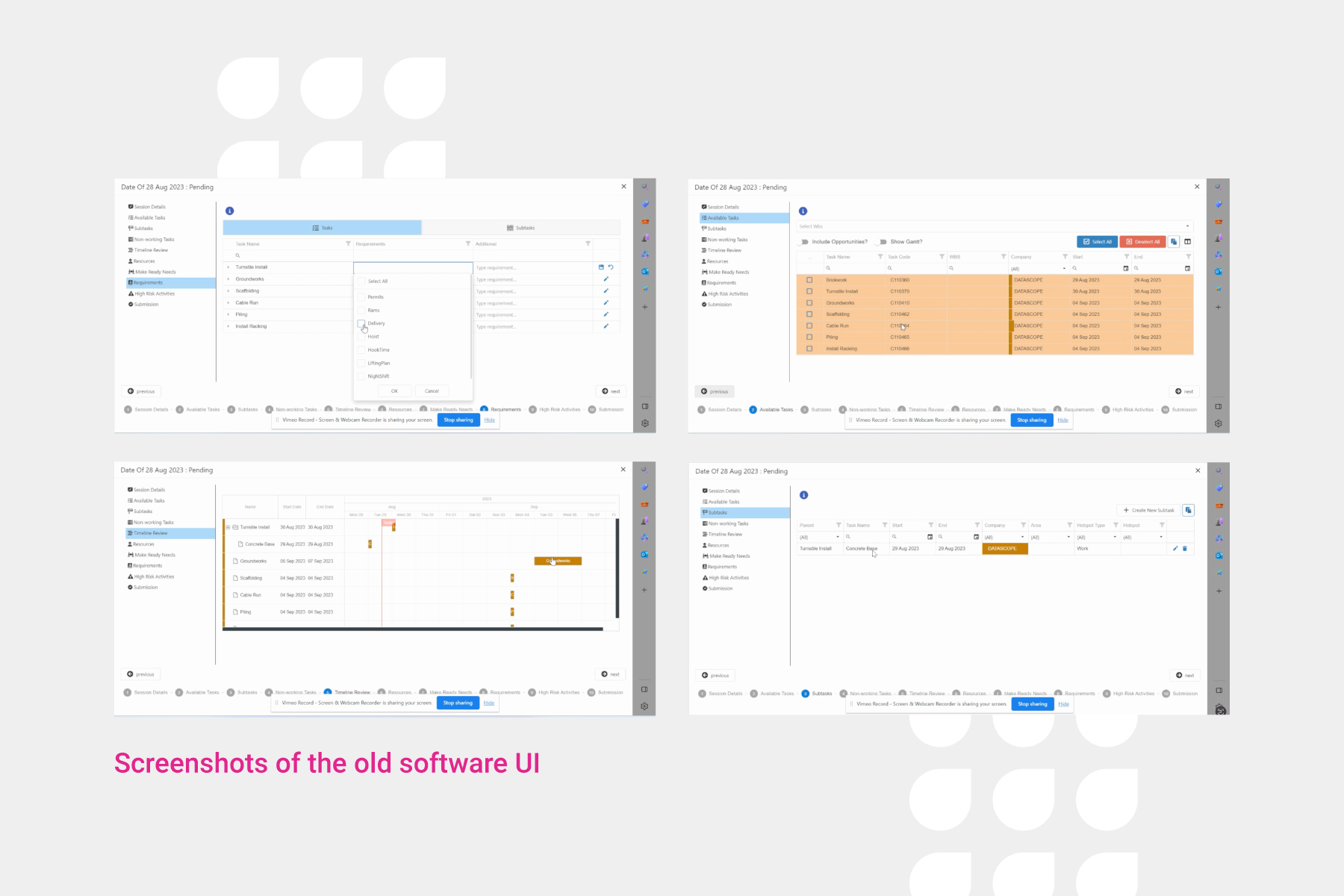
This client is a software and training provider in the north of the UK. Originally the brief was to take their findings from user research to improve both the UX of their solutions but also the UI.
This led to even further projects, such as small brand refresh that enabled the business to roll out improved platform functionality, alongside a fresh new look that their customers would be able to comfortably and confidently show to their own customers.

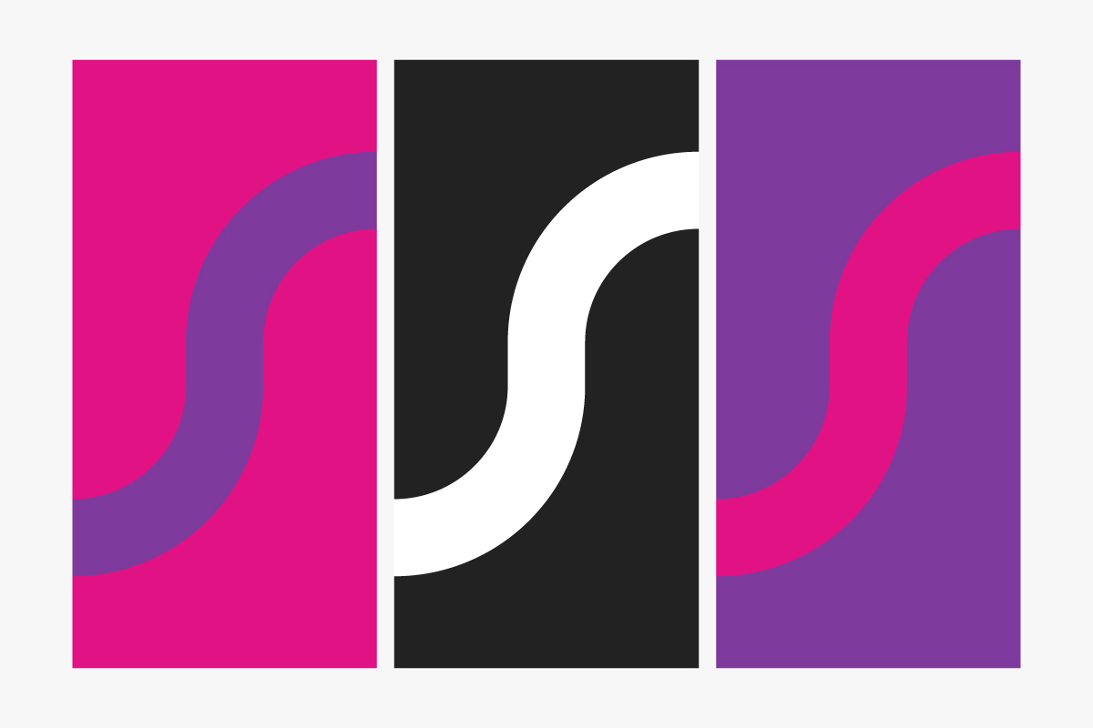
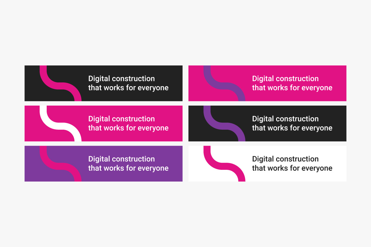
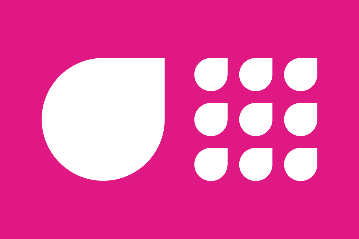
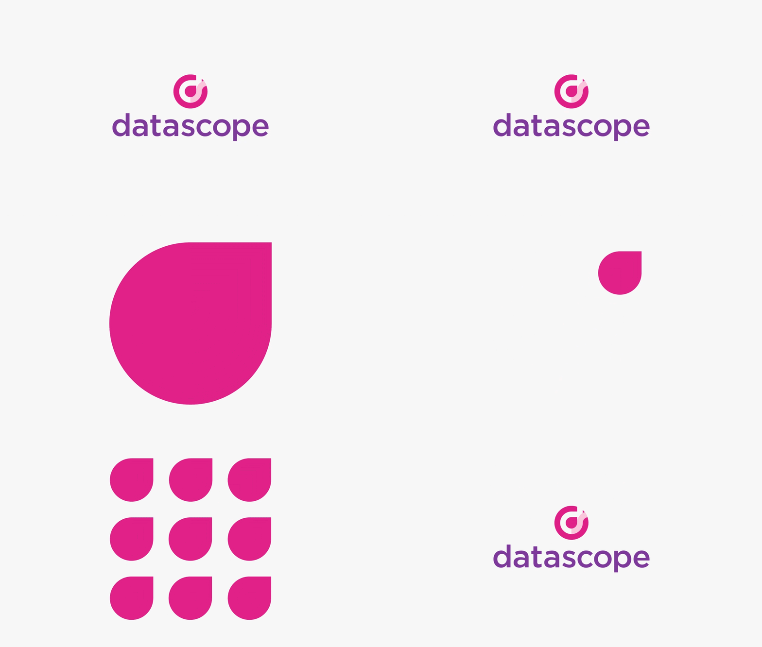
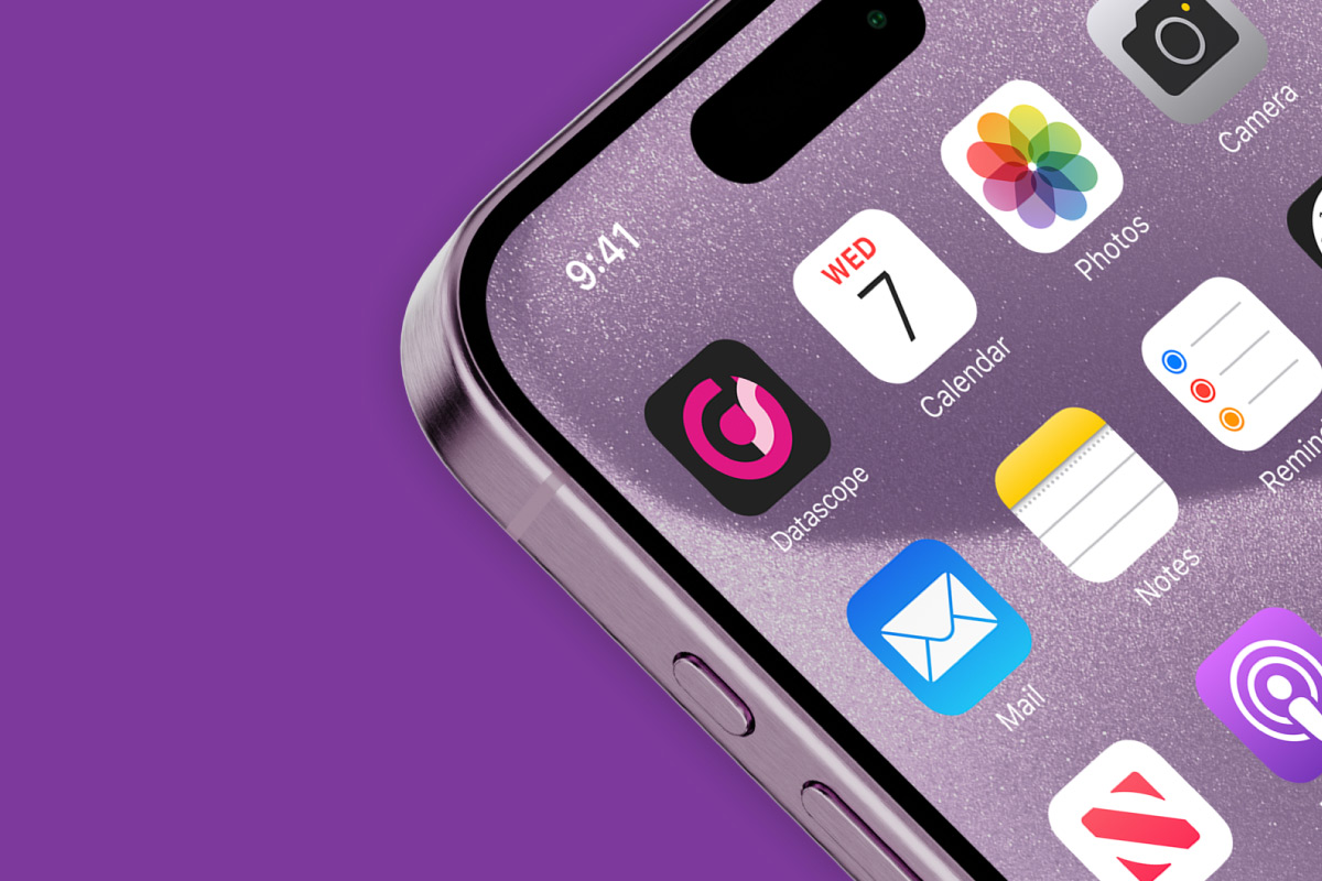
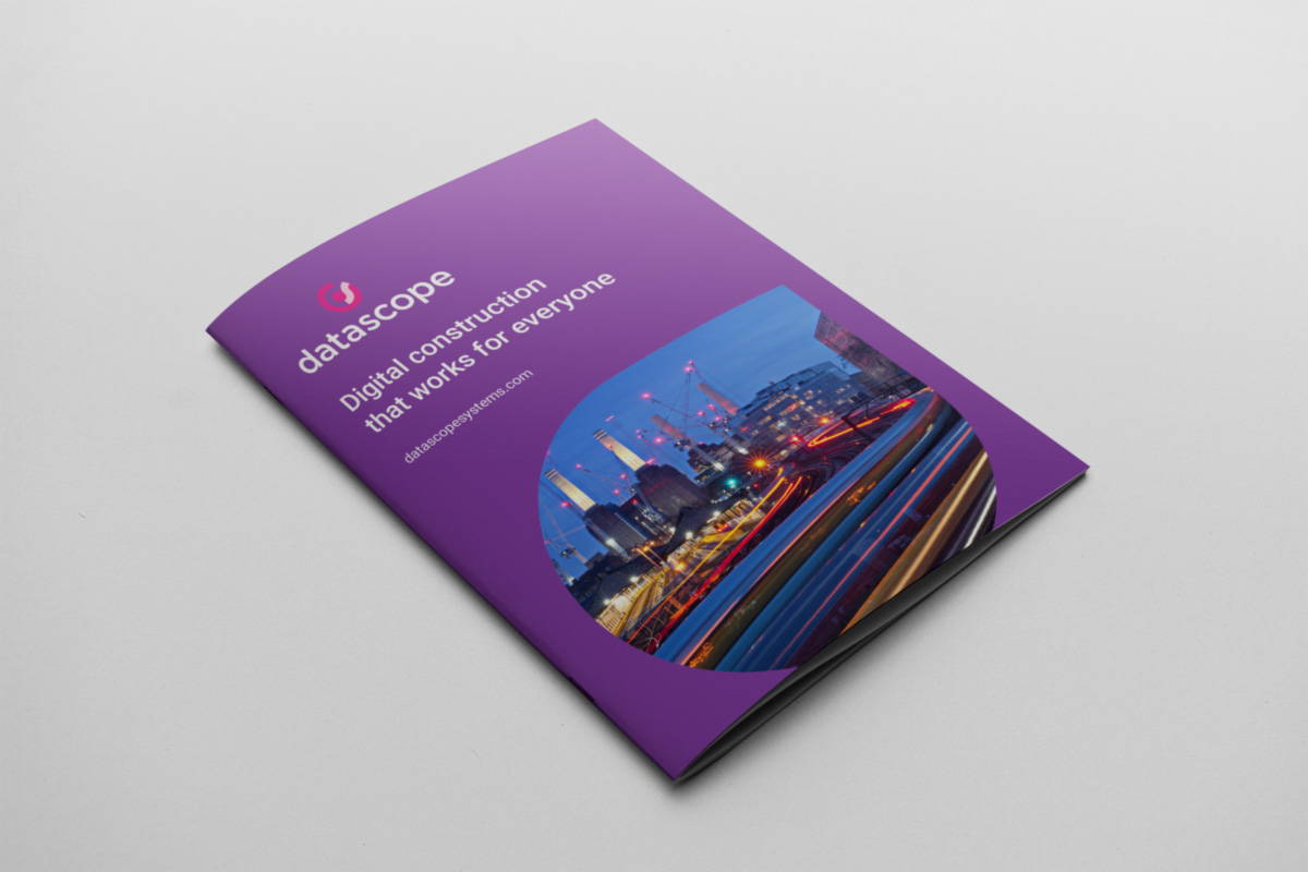
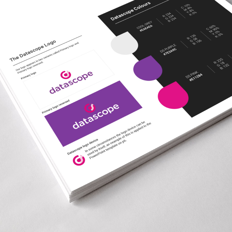
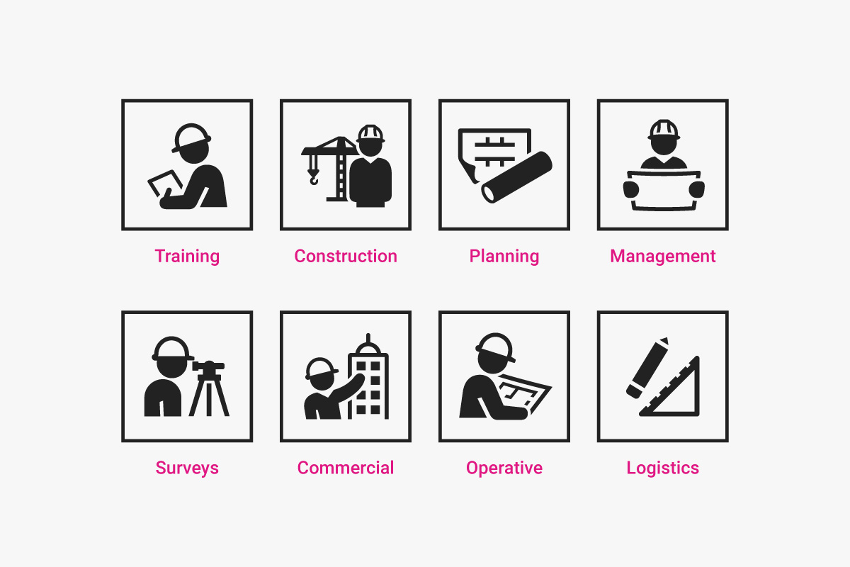
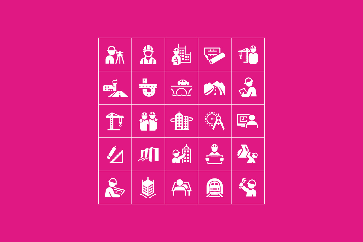
The Datascope brand had functionality at its core, with easy to read fonts and simple graphics.
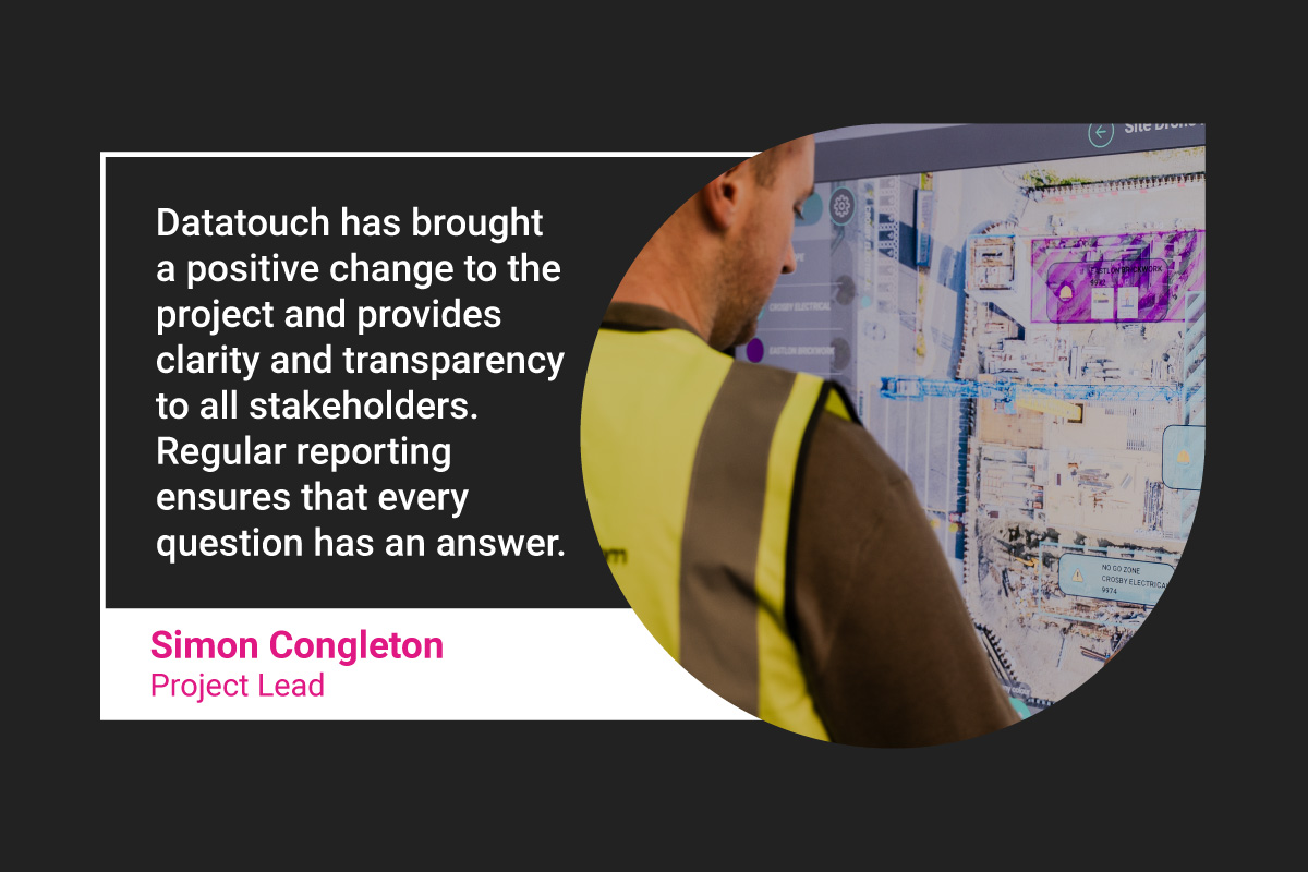
The audience for many of Datascope’s products was very specific to construction managers and people involved in the industry. The aim was to create something that was appropriate to this group of people. Roboto for example is known for its legibility and flexibility, which was perfect for not only the brand identity, but also for the software, website and other tools.
The teardrop graphic device was used throughout the assets, always linking back to the logo and providing consistency but also a creative touch to ensure that the brand refresh had a element of freshness and individuality throughout the outputs.
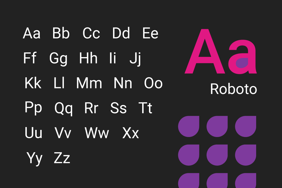
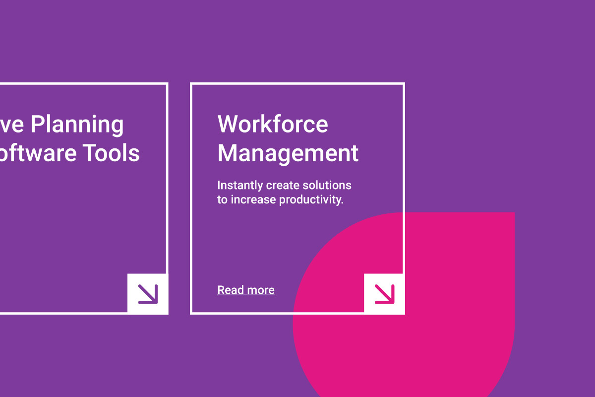


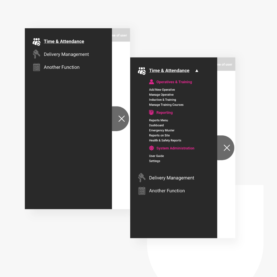
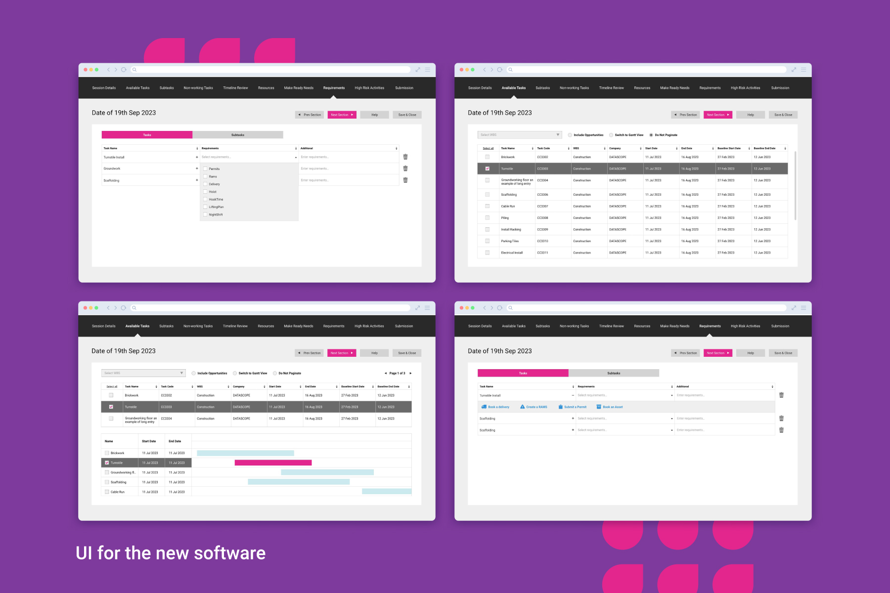
From brand design to UI design, transforming the experience of the software itself.
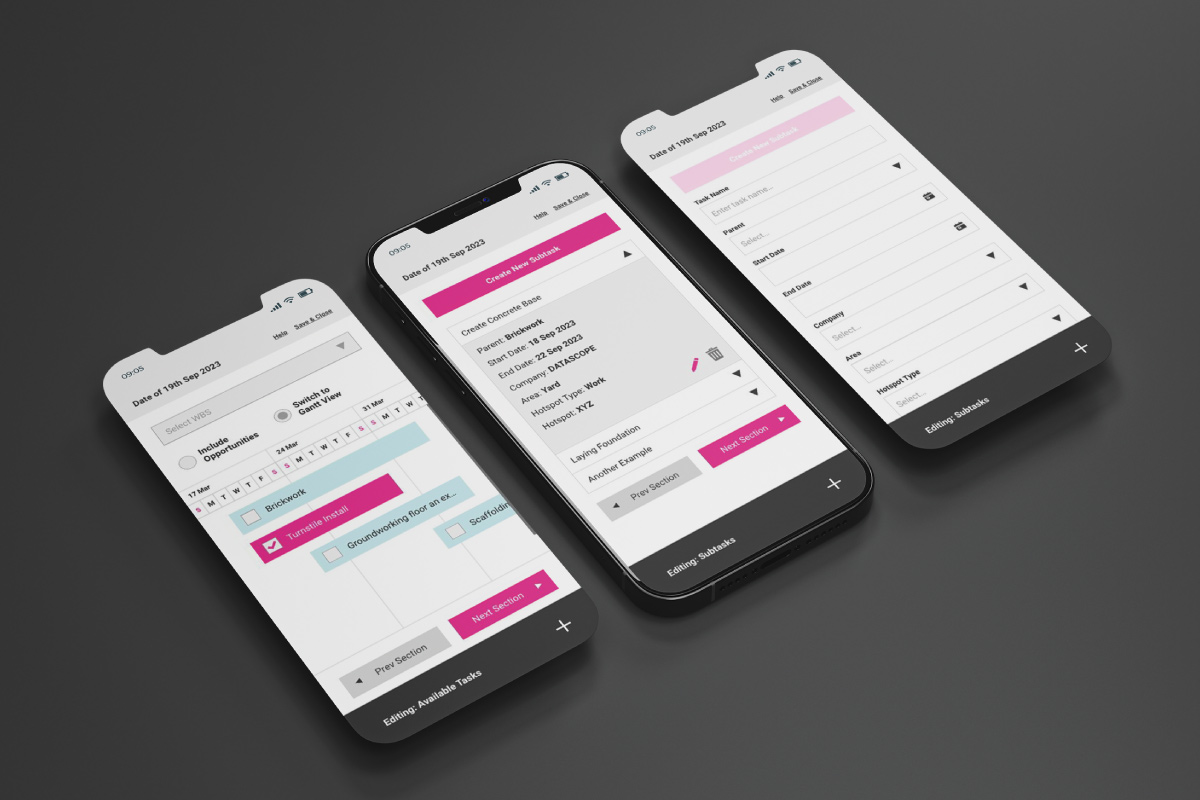
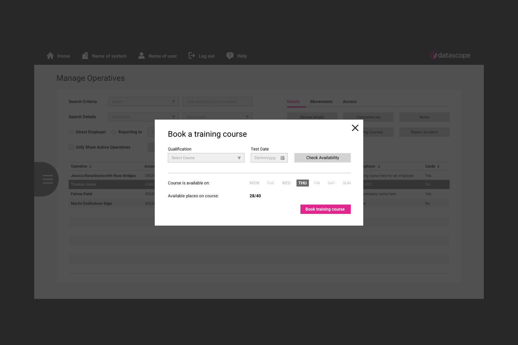
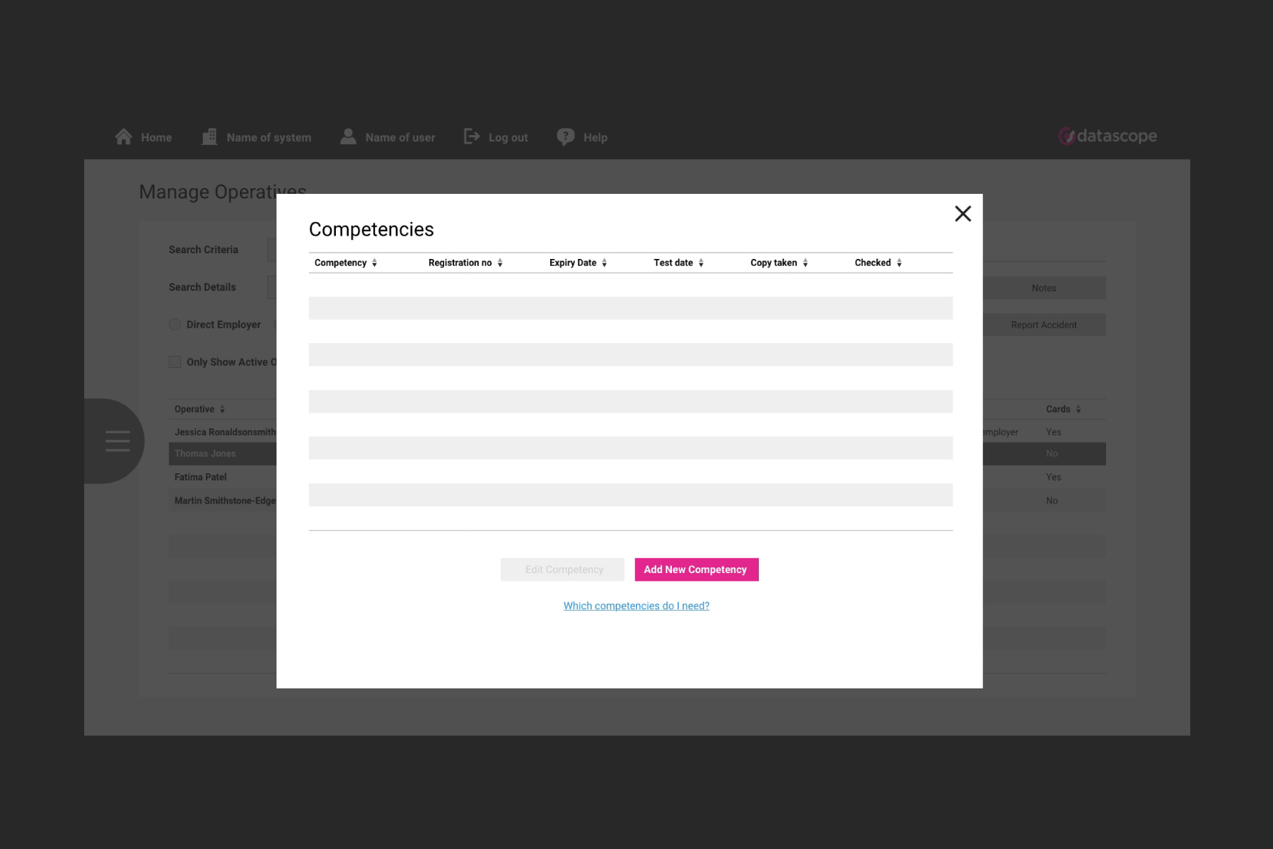
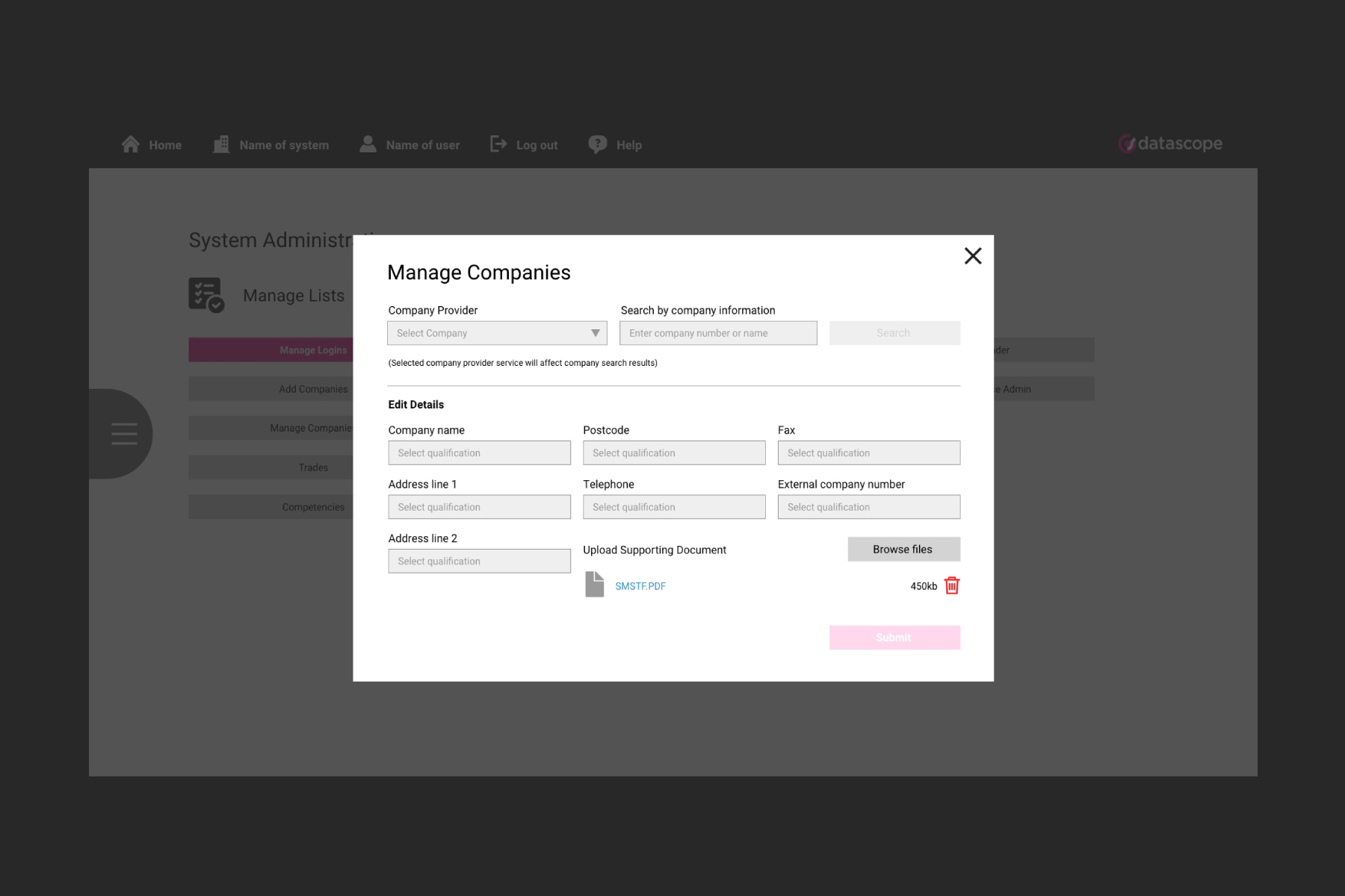
As a separate task from the brand identity work, I was leading a team of junior designers to create a whole new interface for the Datascope software. This was a big task with lots of different variables.
The original scope of this task was to take what they currently had, which according to user testing, was not performing great for their customers and focus on form design and an easy through the complex tasks. Maintaining a high level of quality throughout and applying the new brand elements whenever appropriate.
