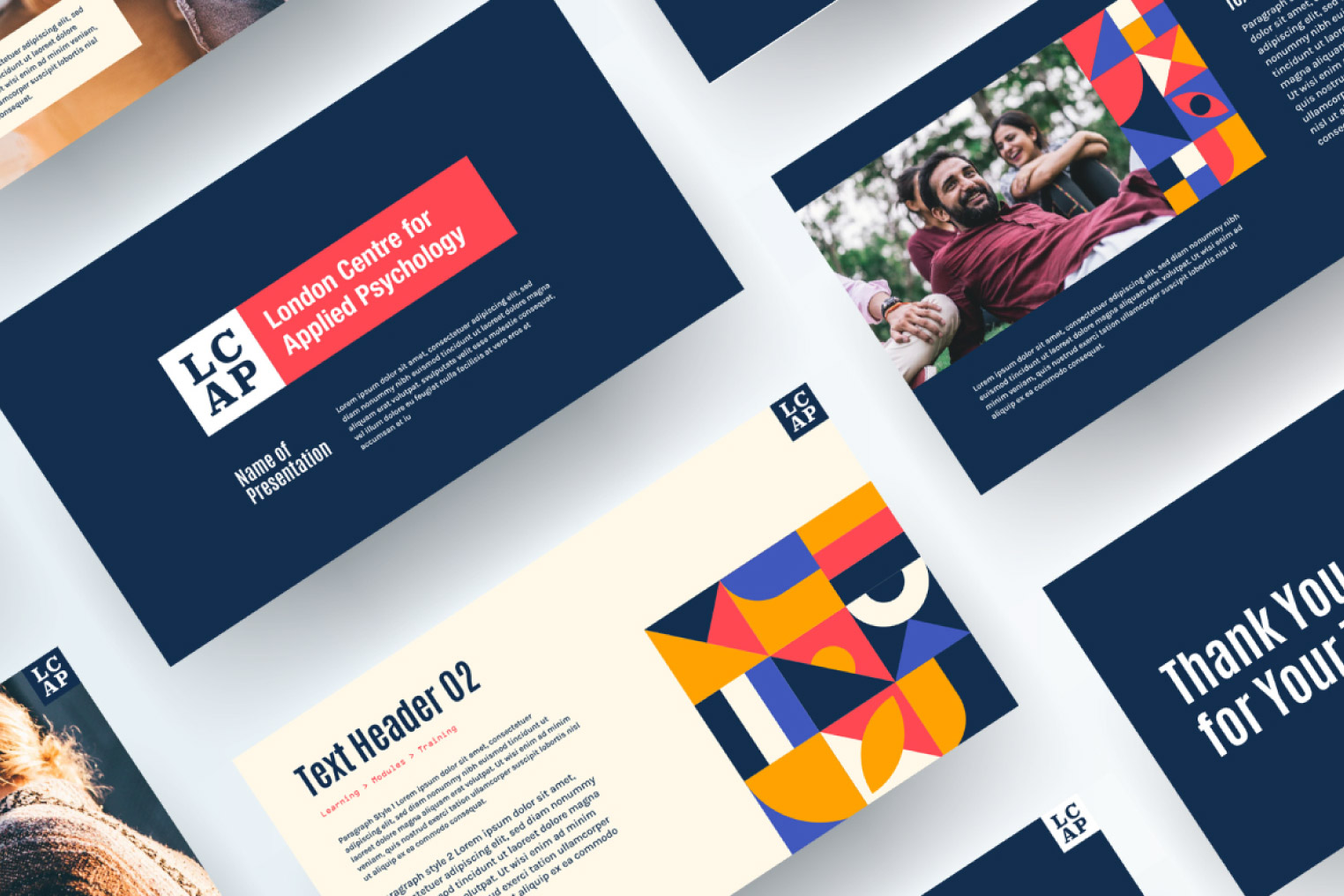
London Centre for Applied Psychology
Vibrant and bold new design, appealing to a younger demographic for an established online practice.
Industry: Healthcare
Category: B2C
Year: 2023
Overview
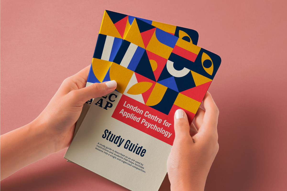
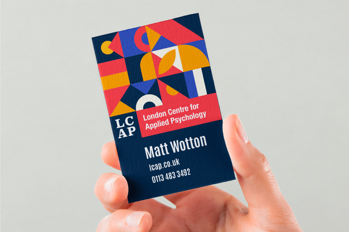
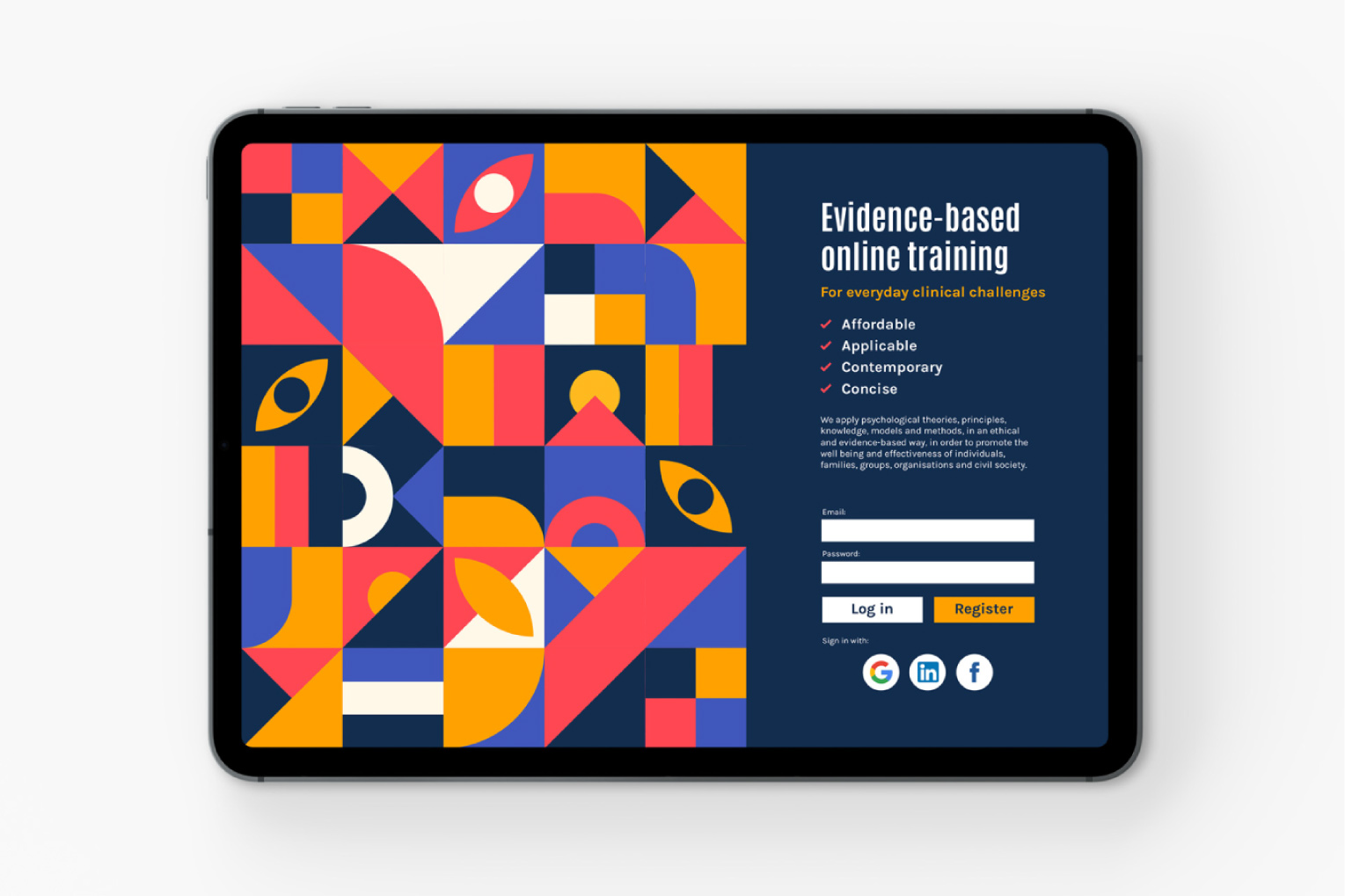
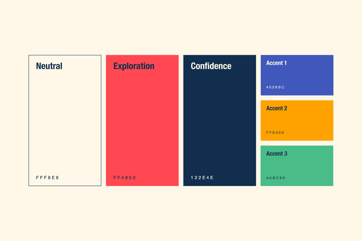
The core asset involved in the rebrand of this London based healthcare service, was the illustrative and exciting pattern. The pattern represented a core concept to the business and was uniquely worked out across all the brand touchpoints, from printed stationary, to digital and UI uses. The vibrant, but appealing colors carefully chosen to meet accessibility standards.
The objective of the business was to reach new audiences, so this rebrand was a perfect solution for them to engage in such marketing activities, using the redesigned set of assets, providing a consistent user journey for any new client or customer who will engage with the business.

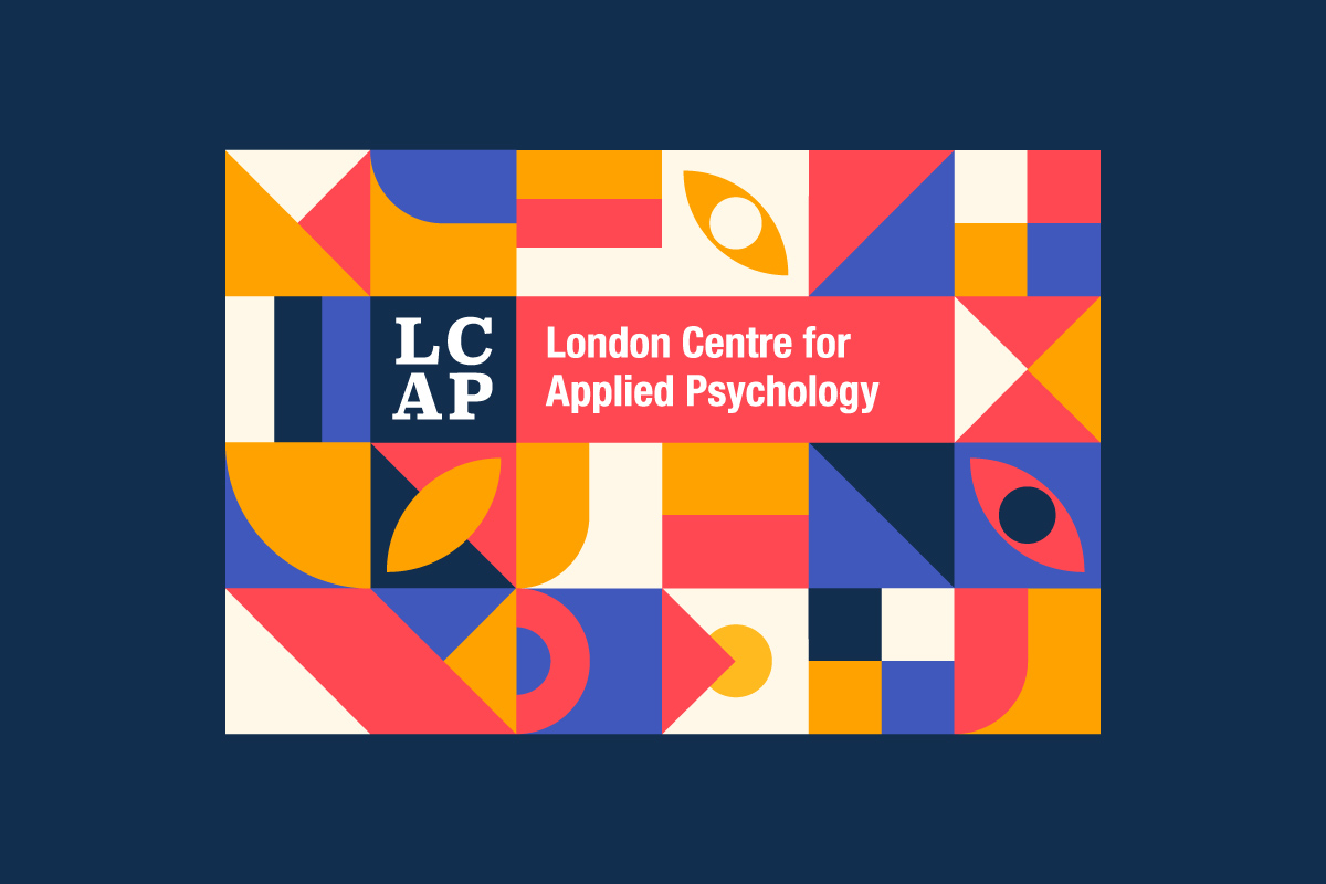
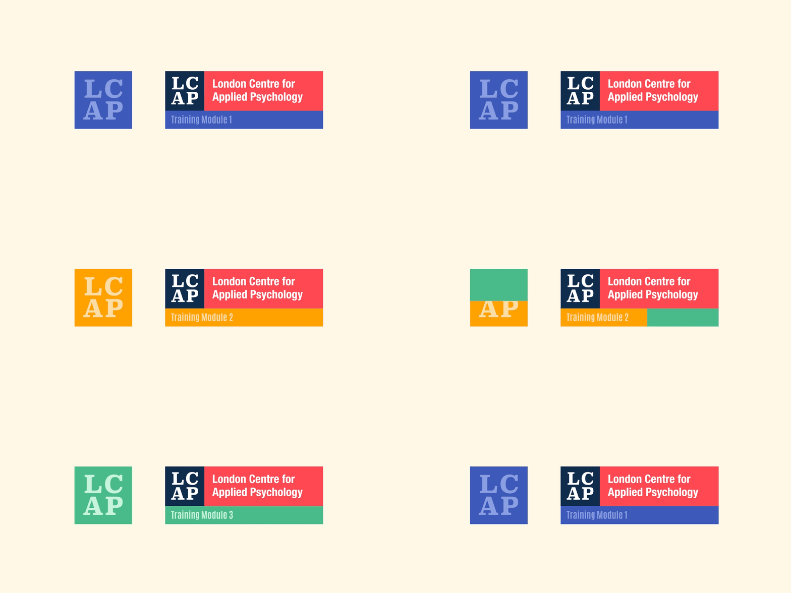

A modular pattern that is both versatile and exciting.
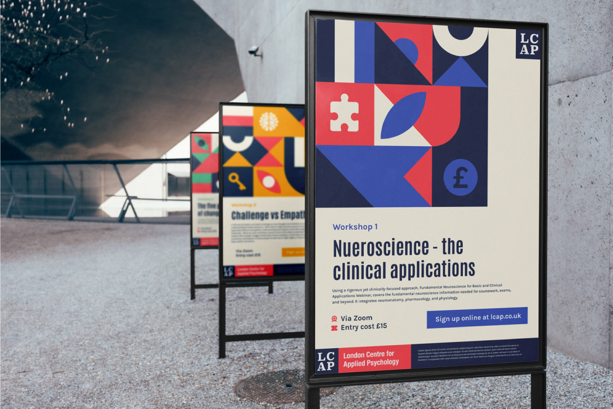
This central brand asset would be the key visual for a wide variety of different outputs. The design of this grid-based graphic allowed for variations in the design to suit the final product that needed to be made. For example the icons and colours seen above could be built into a new grid pattern, which then has a new meaning and new application.
This allowed for future flexibility as well, if there was a need to create additional brochures or marketing materials for a specific topic, or trend, the pattern could easily adapt to the new requirements.
